Monday 29 February 2016

Branding a colleague

I offered myself to brand my colleage Connell. I had a chat with him about his personal and professional interests.

He stated a few facts about him. Another colleague that was working with us highlighted that Connell always works with mindmaps. It's actually something very characteristic of him. I combined that feature with the fact that he considers himself a digital designer that could work as a theme.

I thought about computer circuits, as they look like very complex mind maps. Combined with his favourite colour, blue, it acquired a neon futuristic look that he liked. Not only that, but he agreed that the mindmap idea really represents him.


Choosing a typeface, I asked him to make a test to know what kind of typefaces would work for him. But the results weren't great, so I made text keeping in mind how I see him. After that test, and some research into other typefaces, I showed him around 10 different choices. He really liked my selection, and chose one of the typefaces.

Friday 26 February 2016

Lord Whitney

Yesterday we had the oportunity to visit the studio Lord Whitney and have a chat with the creative directors: Amy Lord and Rebekah Whitney.

At the end of the presentation they had for us, I had the opportunity to speak to both of them. I asked more about how to identify what's 'my thing'. They were very nice and interested in my concerns and their answers were very helpful.


I told them I am very interested in colour correction for photography and video, and for second year we have to identify our interest to go even further with it... but that didn't look like an interest that can be much developed. Rebekah gave me a very good piece of advise: try to do things that lead you to what you like to do. I never thought about it in that way.

We were also speaking about my experience in uni as a mature student, as well as some experiences they have had in their story.

A very nice experience to learn from that I'd like to repeat.


Friday 19 February 2016

The problem: 2 black pebbles

I see several solutions to this:

- I'd have a white pebble in the pocket. I'd pretend I'm taking it out of the bag. The money-lender would know that's impossible, so he would have to admit he had 2 black pebbles in the bag.

- I'd ask him to show the pebbles before putting them into the bag. If he says no, I'd say if you don't show the pebbles or you have two black pebbles in the bag you will have to forgive the debt.

- The agreement was 1 white pebble and 1 black pebble. If this is different, then the agreement is not taking place.

- I'd ask him: what are the chances for me to get the white pebble? He would say 50%. Then I'd ask again: how? if you have 2 black pebbles in the bag?

Thursday 18 February 2016

TV Series

TV series take part of huge influences of my daily basis work. I've watched many, and I still do it. If I had to recommend what I consider the best ones, this would be the list (I'll avoid any type of spoil):

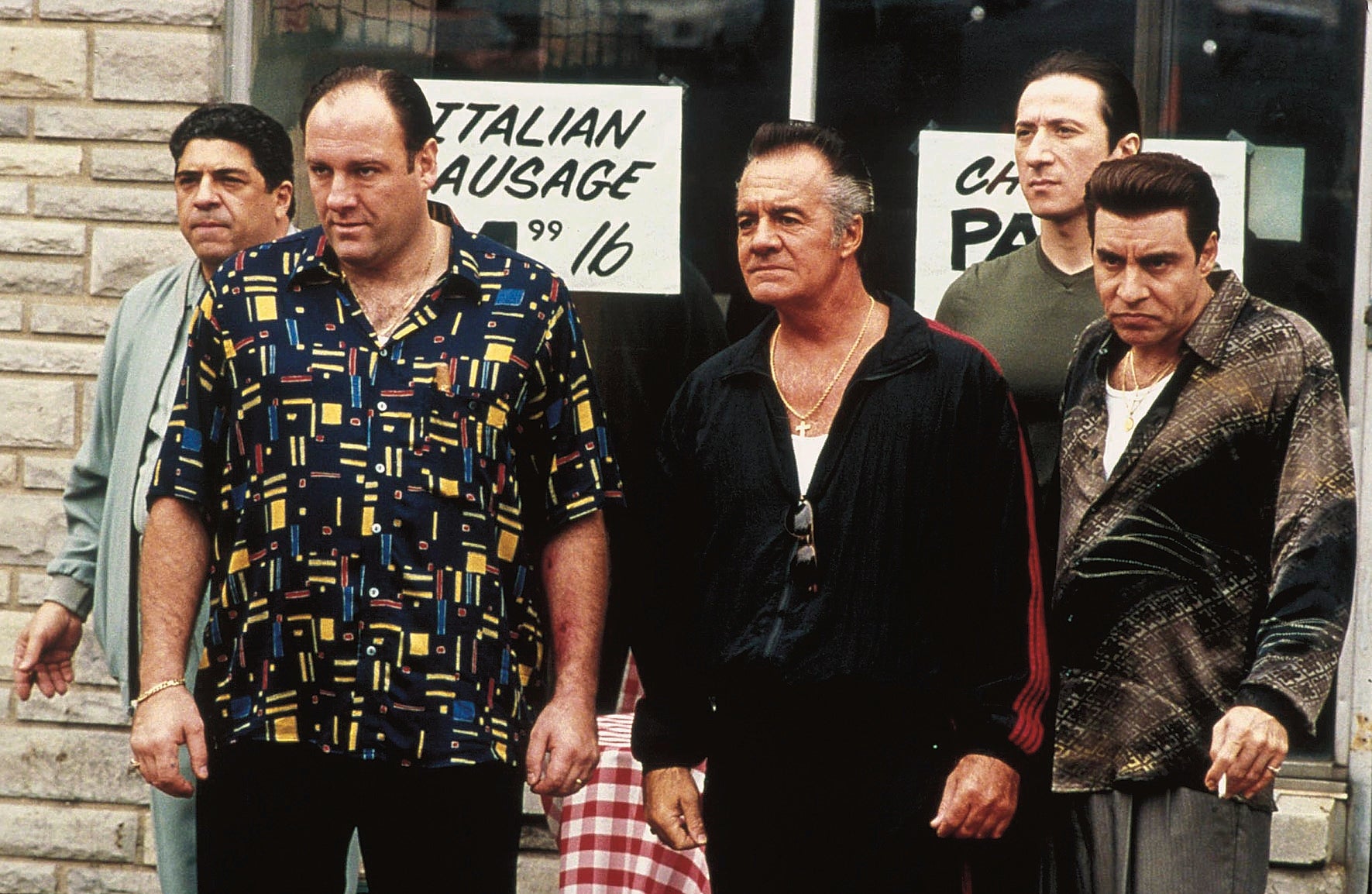
1.- The Sopranos.

This master piece is not just brilliant in every single episode with an outstanding plot. The cinematography and camera work is just something else. It gets perfectly along with the actors and gives the feeling of being watching through a small hole in the wall. As a mafias-related plots fan I consider I am, I'd say this is the most realistic TV series in those terms. I've never been in a mafia myself, but after watching The Sopranos almost everything else feels like a farse: forced and way too dramatised.


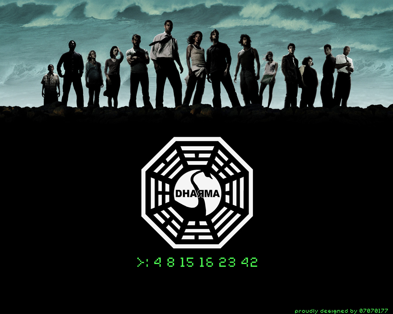
2.- Lost

Probably one of the most misunderstood pieces of work that deserved much more. Lost never stops being intriguing, surprising... upto the point that when it finishes, there is an emptiness within oneself. If there is something I learnt as a graphic designer with this series, is that you shouldn't give everything away from the start. Putting the best of a film in the trailer is a huge mistake... in my opinion, of course.


3.- Utopia

This already cancelled English TV series was being one of the most outstanding content I've ever experienced. Colour treatment it's very engaging, very bold for the type of plot, but works perfectly. The soundtrack is just magic and unique, a mixture of tribal and electronic music in a dark and sinister combination that tells perfectly the story that is going on. Promotions and design for the show in general show a high understanding and awareness of graphic design.


4.- Black Mirror

Another English TV series that has an awesome work of promotion as well of production. I find the plots of interest, as they put in front of us values we consider correct, making them look horrible and making our world go upside down. A very good piece of work that makes the audience understand a little bit better the hypocrisies of the society we live in.


My progression in the course so far

This post is a quick evaluation of what has been the course to me so far.

If I have to put it in short: I've learnt a lot. It's impossible not to learn being surrounded by so many creatives. Although, there are so many things worth reading, watching, visiting that one feels a bit overwhelmed by everything. I would like to visit galleries but I don't really know where to go or what to see... maybe a list of recommendations from college would be really helpful. I know it's my responsibility to find these events, but at the beginning some guidance in this matter could be very helpful, like college do with books for the modules.

About the facilities, it is true that the more you use them more you know their strenghts and limitations. I feel a bit 'scared' of doing crafts, as I have always been a mess with them... but I know I have to explore them in order to become a better graphic designer, and it is my intention to do it, even if the outcome is not the best. I am just waiting for a good opportunity to take the risk apply those methods. It would be great to have modules that would make us use these facilities. At the time I've used the digital print room quite a few times, and I surprised myself finding many limitations. I think this is something positive, because it means I am trying to push boundaries within this context by reaching its limits.

Tutors are very helpful and the modules teach quite a lot. I understand that we need to learn to manage our own time by doing it, but at least for now is resulting a bit difficult. It is something I have to get used to it, and now I understand the importance of being organised with the time.

Contacting people I admire

Last week with one of my favourite cinematographers (Salvador Lleo) to present myself and ask him for feedback about my work. I haven't had any replies yet. Hopefully I will get them soon.

On the other hand, a job opportunity as video editor came along from the comedian Russell Johnson, a voice actor that has a youtube channel with more than 3 million subscribers. I applied for the job, as I think it can get along with college too. Hopefully, it would be around 1-15 hours a week. It would be a great opportunity to do something related to comedy, which I always liked, and also to work along with someone I admire not just as a comedian, but as a professional. Not to mention the potential that the job position has itself.

Thursday 4 February 2016

#saynotospec

The studio Zulu Alpha Kilo has made this brilliant video where it shows a common problem among creatives dealing with clients.

I have had experiences like this myself, having been even insulted after saying I was not going to work for free. This video reflects how ridiculous is asking someone to work in such conditions, something totally regular nowadays in the creative sector.


Show Your Work

'Show your work' it's a fantastic book by Austin Kleon that gives the keys of how to take advantage of the contemporary platforms we all enjoy without falling in the trap of behaving like everyone else, being part of the mass.

Personally I have made several experiments in social networks (such as Youtube) to see how successful different ways of sharing are. Kleon explains very thoroughly and easily these methods that requires every individual to be part of something bigger instead of remaining like a hoarder and waiting for an audience to fall to the enchant.

This book has helped me to better understand how to establish networks and create an interactive audience. I am now helping my sister, who is an opera singer and wants to take advantage from social networks.

Monday 1 February 2016

Logo for self-brand

The idea of having 3 different triangles that put together like a puzzle builds an A with the general shape and a Z (my initials) with negative space is very attractive as it sounds flexible. I cut out from a paper the three triangles to see how they could work together in different ways the choices weren't many. The purpose of having something flexible but only in theory seemed empty, meaningless and pointless. So I decided to start over with the concept.


It was then when I started writing my initials in different and random orders and this came up:


I noticed that it could be represented by triangles again in a more clean and playful way. It also reminded me to the "pintaderas" from the Guanches of Canary Islands (where I am from), ancient art from the aboriginals that lived there once, before Spain conquered it. I thought this was a coincidence I could use to base my concept on.


Also the addition of a line at the end to represent the last stroke of the Z looks like an underscore on a computer, when it is waiting for the user to type. I thought it could be a good idea for an animation. It also has a meaning of my work is not complete yet, it's being built by bits (triangles) that are very personal.

The animation could be very simple and played in 3 seconds: there is an underscore flashing and after two keyboard strokes that are reproduced with audio the two triangles appear, then when pressing enter (an distinct keystroke) the underscore flashes again, but this time behind the two triangles and with my name below it.

More exploration with triangles brought interesting results. I was able to write A and Z with one in particular. One shape made out of a symmetric structure (2 triangles) represents myself, that only can be completed by a foreign agent. When that symbol is rotated it looks like a Z, the first letter of my surname.


More experimentation came after these results, as the design seemed to have some emptiness and asymmetry that I think don't represent me either me or my work.

When placed the A and the Z into a triangle a more engaging and intriguing shape came up by representing the values I was mentioning before. Most of the people I asked about which design is the most appropriate they agree is the one with the black background. On one hand, the design is solid and almost symmetrical, and when the head is tilted to the right my initials are visible (A and Z).

The design from the aboriginals in my homeland is kept with the triangles, but leaving the one in the center open. This can have various interpretations: different triangles are linked (which can represent the way I am eclectic) or that it is not completed (Just like me. I don't know everything, but all the opposite: I still learning new things. It is never going to end and it will be always interesting).

By using simple shapes that creates a shape with different readings also reflects the way I work: by adding various meanings to what I do in subtle ways and keeping a solid and familiar structure.

The triangle would be upside down as this symbol represent "female". I am not a female, but I like to think that I work hard for feminism and when someone says that I have feminine perspective regarding some things I consider that a compliment, as it means I am able to see things from others eyes and shift my perspective if necessary.


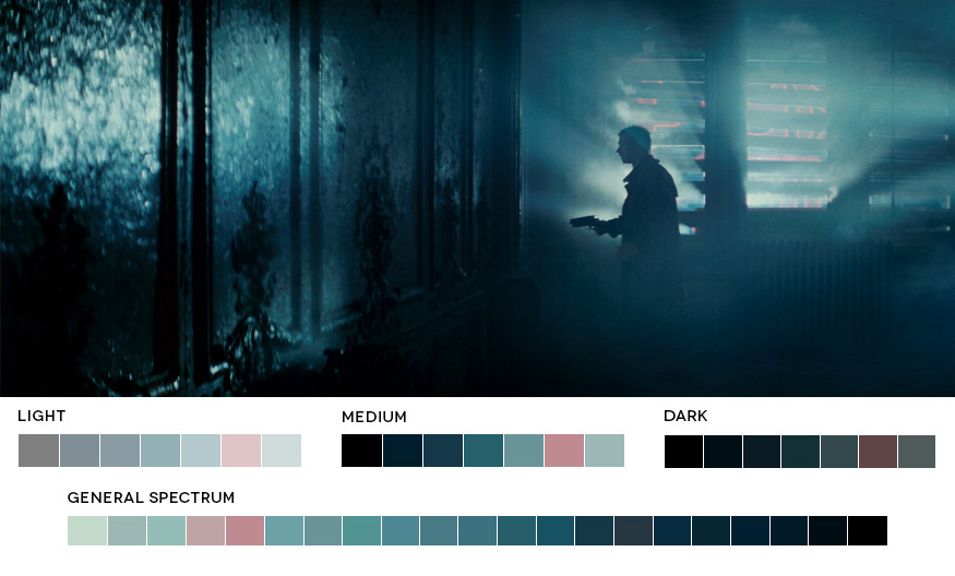
Then it came experimentation with colours and typefaces. The chosen colours are given from my passion to cinematography and urban looks, so it was inspired in films like Blade Runner. I used lighter colours for upper parts and darker for the triangle at the bottom. The typeface has the colour of the two triangles with lighter tone, so the strength in the design is distributed.


After experimenting with different typefaces with the design logo to make sure everything is consistent, I decided to choose a Sans-serif font as it goes better with logo as well as give the brand a relaxed look instead of a more formal one.


I used the book "Stop Stealing Sheep & find out how type works" by Erik Spiekermann to help me find out what typeface I should pick. It was then when Helvetica Neue came across, and it was my favourite typeface before starting the course. After watching the documentary about Helvetica and know what is around this typeface, I think it is a typeface that represents me in some ways. It has been very critisised for its overuse. Everyone wants to be original, but who doesn't? I personally believe that using the same as everyone else doesn't make us be the same or lack of originality. In my opinion, if something is well made, it should be used, and Helvetica is the perfect example. It would be wrong if it is used for absolutely everything without considering other options. But just because it's widely used, it doesn't mean that using it is commiting some kind of sin or heresy. It reflects not only how I think, but how I make my decisions designing: I always try to be practical and I like to take risks, but up to some point. It also conveys, with its shapes, sophistication and simplicity, things that I always try to have in my work.

After checking all the types of Helvetica Neue, the most appropriate seemed Helvetica Neue LT Std 35 Thin, as it wasn't too thin (to avoid printing problems) or too thick that wouldn't represent me. Choosing the intermediate choice is also typical in my design decisions. I chose to keep it in lower case to remove any ideas of hierarchy and convey more simplicity. The use of the name Alex (for Alejandro) it's a choice based on make it easier for an English audience to pronounce and remember.

The size was given by the width of the logo and making it multiple of the size of the lines.


Although I was happy with helvetica, I wanted to check other options, so I took a different way to experiment with typefaces. There is a type of customised searching system for fonts on internet I decided to try. I asked my girlfriend to choose the different elements of a typeface that could define me. The results were horrible, but at least it gave me an idea about what I didn't want for my branding. The interesting thing is that I made the same for her, and she wasn't happy with the results either. So I tried to do it trying to consider myself as a professional rather than my personal attributes. Then some alternatives came up:

http://www.fonts.com/font/itc/itc-ronda/regular

http://www.fonts.com/font/international-typefounders-inc/aquarius/medium

http://www.fonts.com/font/microsoft-corporation/nina/regular

http://www.fonts.com/font/linotype/stymie/medium

http://www.fonts.com/font/shinntype/preface/book

http://www.fonts.com/font/identikal/monark/light

http://www.fonts.com/font/font-bureau/pennsylvania/regular

Among all of them I'd highlight ITC Ronda as it can make an interesting contrast with its rounded shapes and the triangle. Despite I think Helvetica Neue works quite well with the logo I am not sure about the lack of personality of the typeface being a Graphic Designer myself. ITC Ronda is, after all, a bit bolder, naturally enhancing some features the typeface already has, like the unusual shapes of the "a" and the "e", making it more suitable for a graphic designer identity logo.

Fallout 4


As graphic designer I find Fallout universe an endless source of inspiration as well as the perfect example of consistent design decisions.

Even when booting the game Bethesda Studios show their logo in an animation specifically designed for this game, in its own theme: a futuristic post-apocaliptic world full of horrors and dangers caused by radiation with technological aesthetics from the 30's and 40's and a machiavellian sense of humor, as the environment related to nuclear shelters is very corporative and way too friendly.

The pictograms, logos and other things in the game are following the same principles and that is what makes it so consistent and attractive.